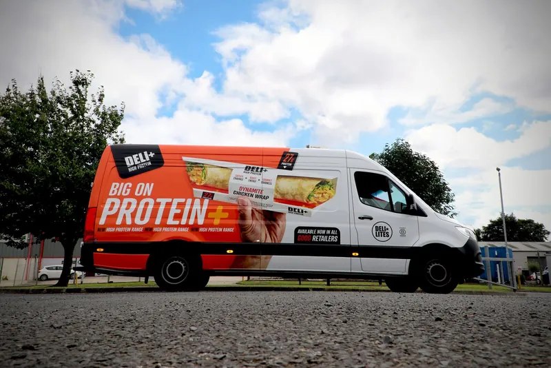
High-protein range
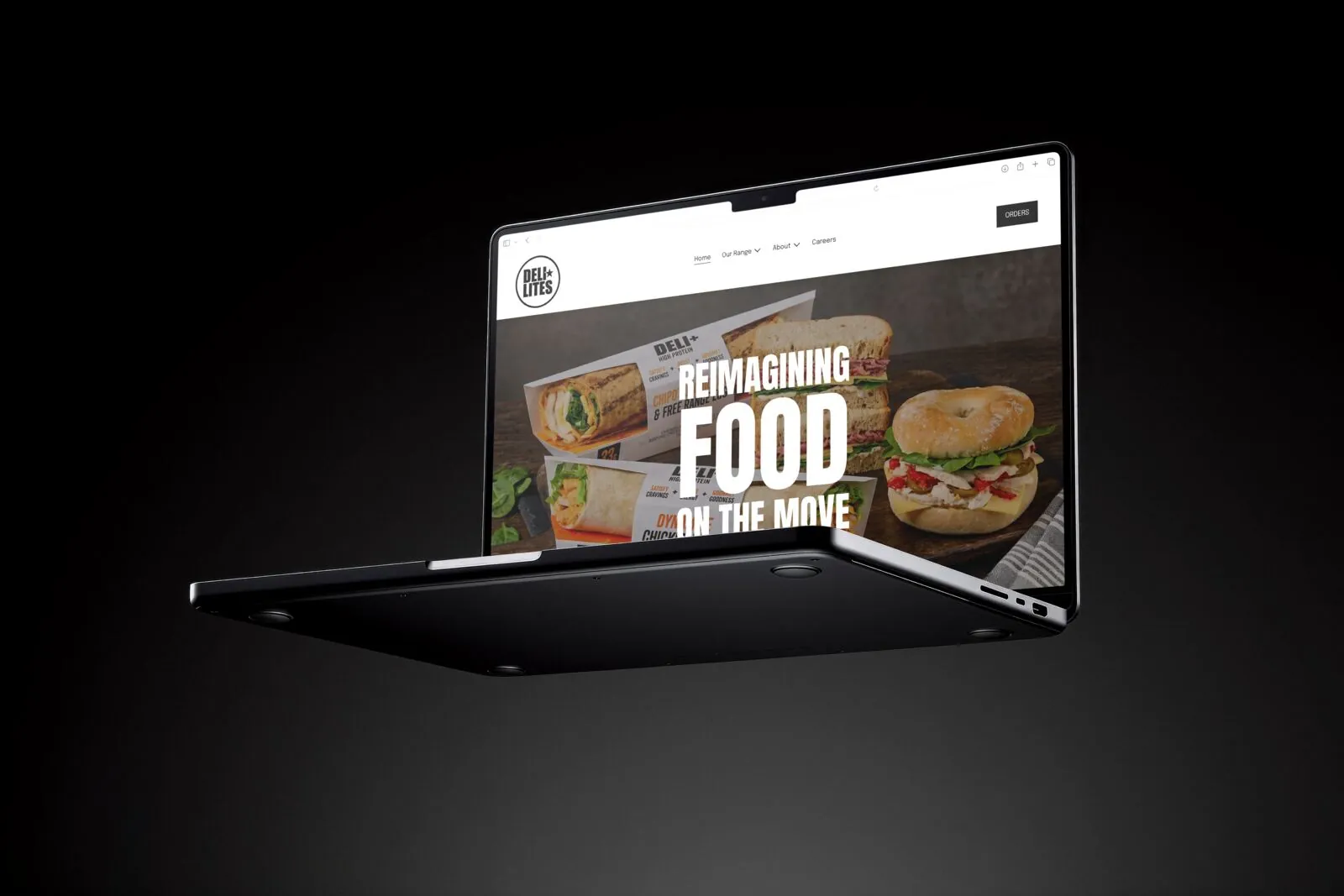
DELI+ — brand, packaging and launch system. High-protein real food for the chiller, not the gym aisle. From first concept to multi-range system, live in market.



Outcome
A protein-led sub-brand — DELI+ — launched in stores in October 2026. Packaging, photography, site, vehicles, outdoor and point of sale ship as one system. The same rules now carry new ranges to shelf, so each product joins a family rather than starting from scratch.
Challenge
A large food-to-go manufacturer needed a credible high-protein offer for Ireland and the UK. The commercial risk was clear: protein lines drift toward the gym aisle and read as supplements. The range had to signal performance while still looking like proper food, and sit under the master brand without distorting it.
Approach
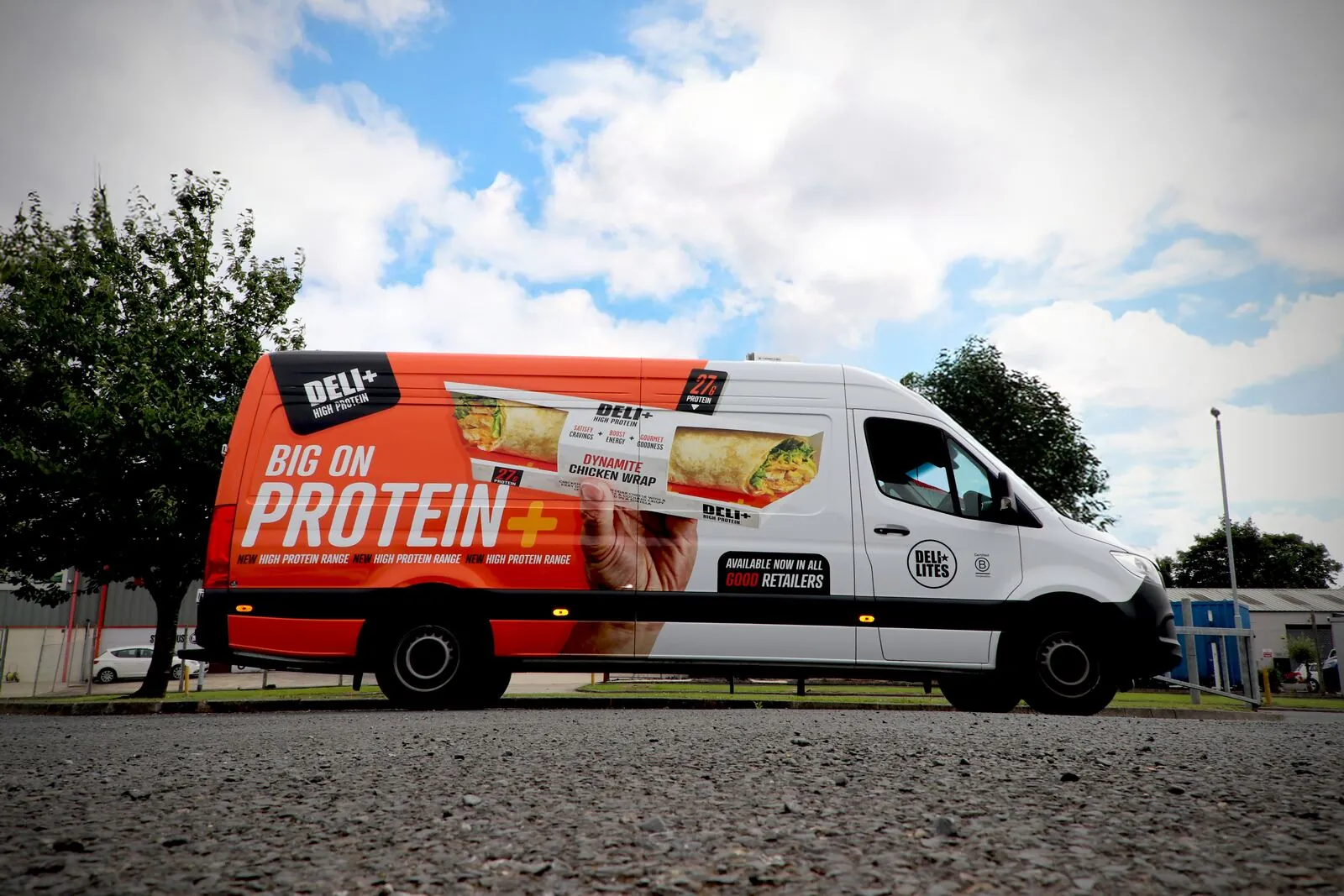
Build a durable system, not a single pack. DELI+ is defined by a bold black wordmark, protein and fibre numbers set large as the pack hero, and colour led by flavour. On the wraps, a benefit strip (Satisfy cravings + Boost energy + Gourmet goodness) carries the promise. Master brand remains present but secondary. One hierarchy across pots and wraps, ready for the formats that follow.
Pack & photography
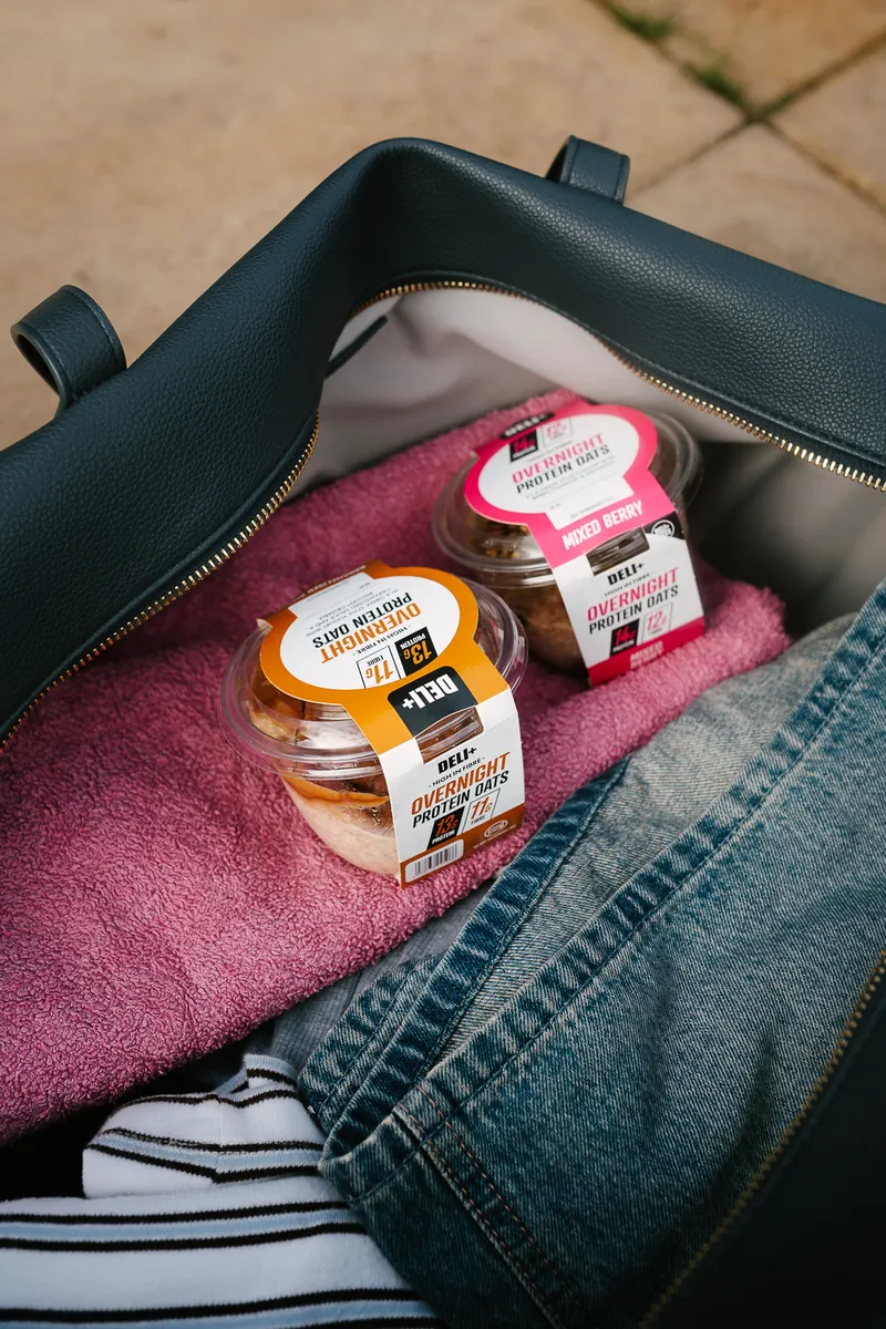
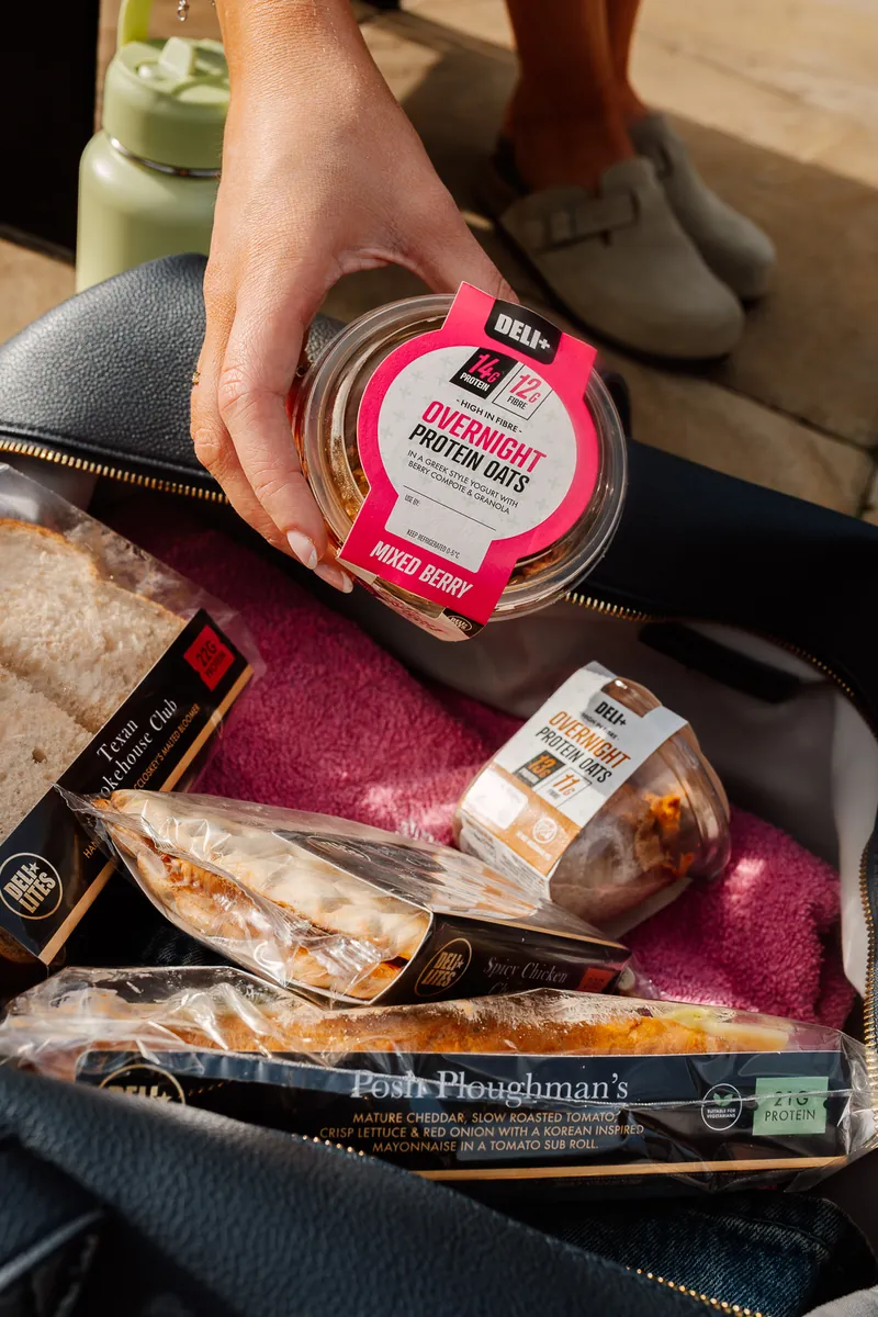
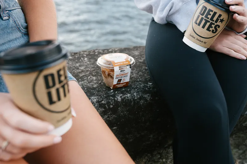
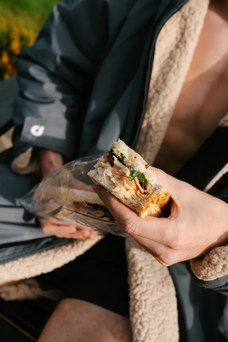
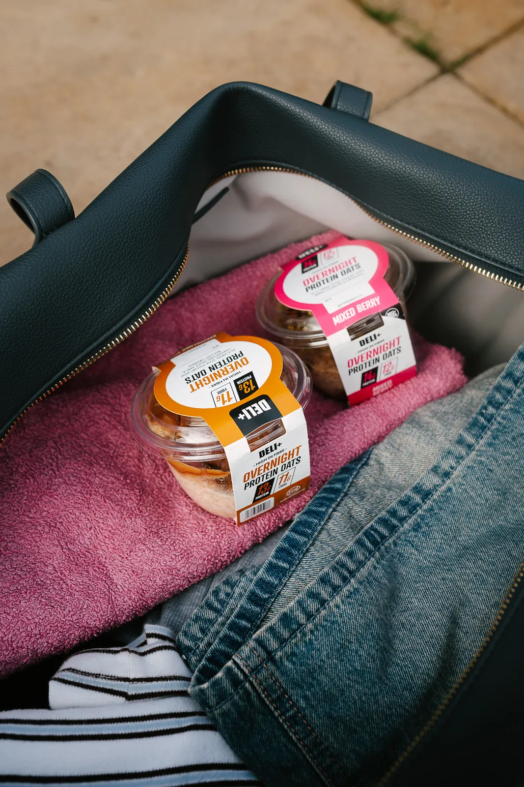
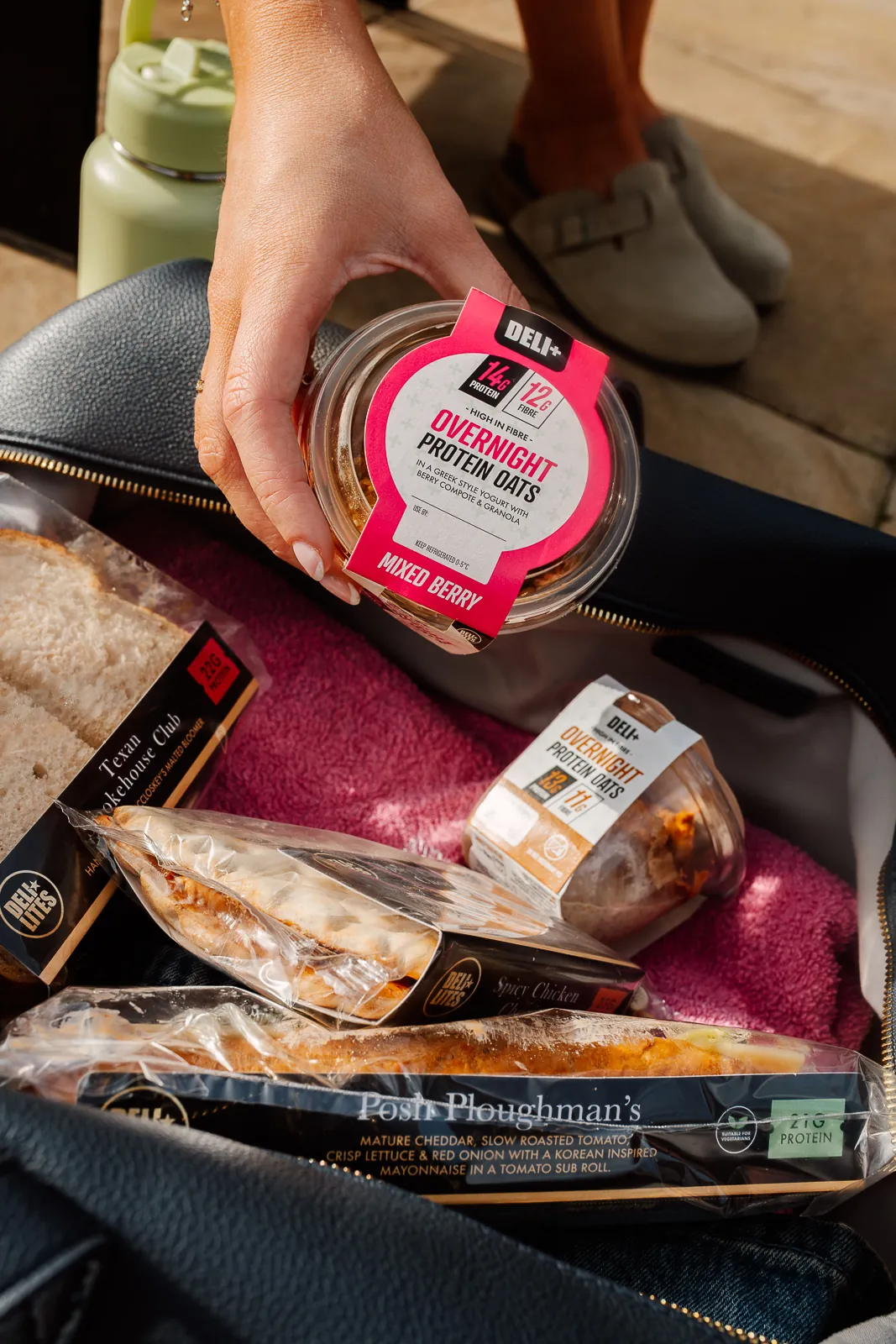
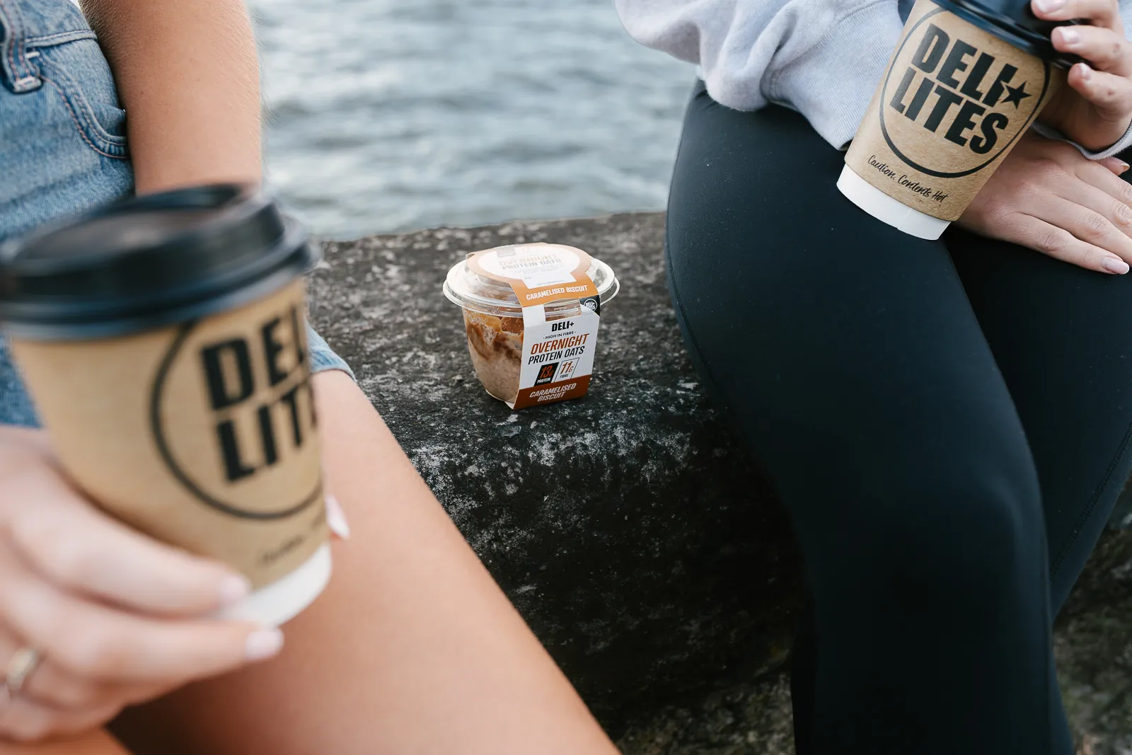
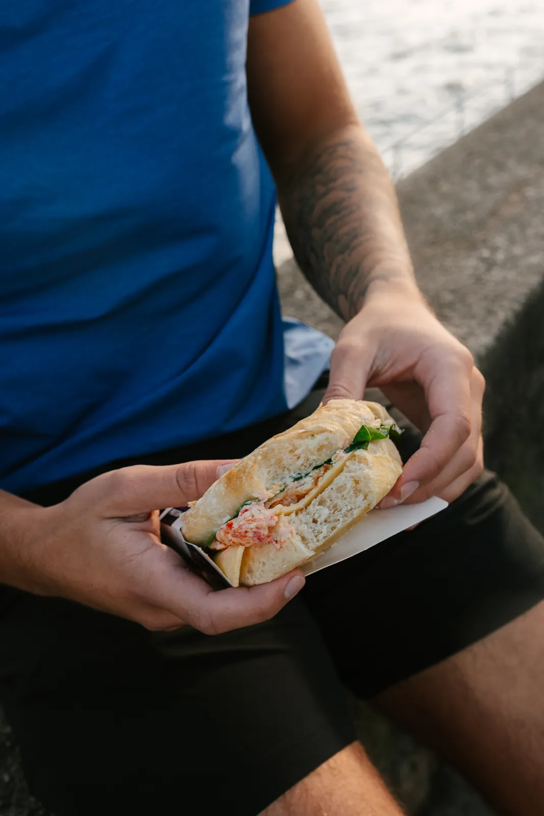
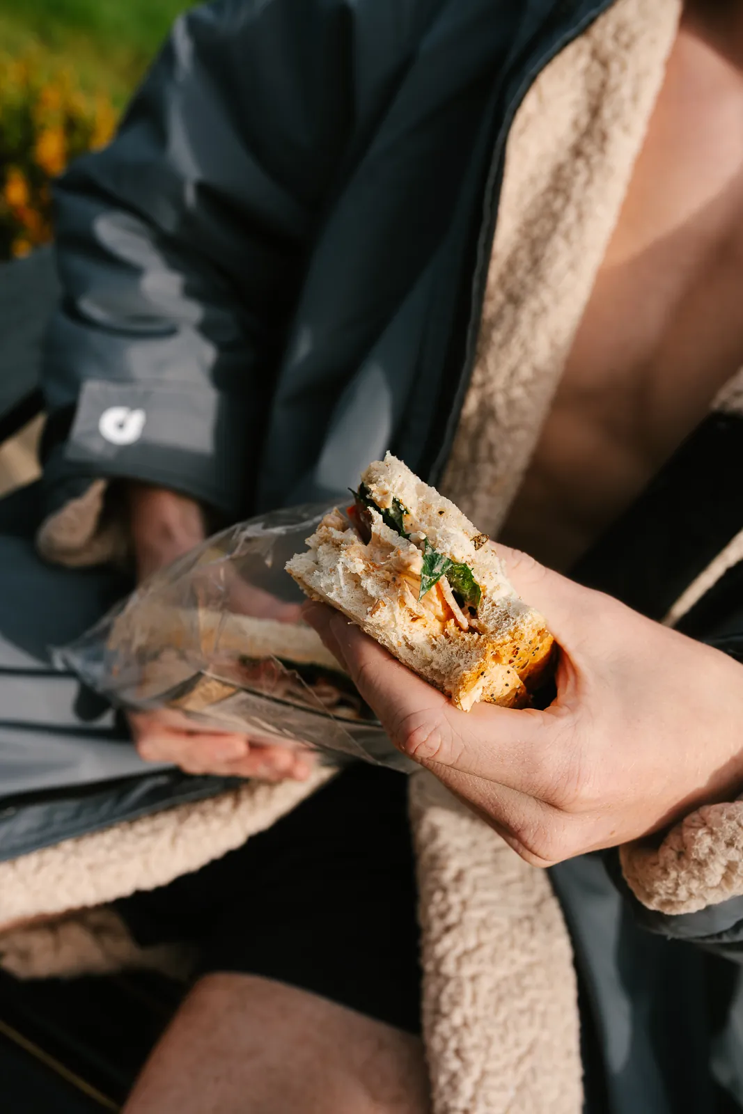
Appetite first: product visible, macros readable from the chiller. Photography is lifestyle-led — real mornings, movement, product in hand or bag — so the range never looks like a shake brand. Pack stills use dark surfaces and ingredient cues where needed.
Launch & scale
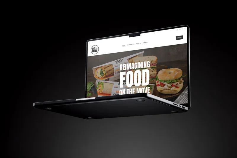
Identity, pack, photography, launch site, stockist finder, van wrap, OOH and POS were directed as one piece of work. The system is now extending range by range (salads and further formats in development), adapting structure without diluting the rules.
Identity system
- Mark: DELI+ in bold black, used as a badge on every pack
- Colour: white fields and near-black type, with colour led by flavour (orange for Caramelised Biscuit, pink for Mixed Berry)
- Hierarchy: protein and fibre numbers as the pack hero, readable from the chiller; benefit strip on the wraps
- Photography: people and context over sterile studio; warm natural light
- Voice: direct, plain-language benefits — no supplement jargon
Scope
- Brand strategy and identity
- Packaging across formats
- Photography art direction
- Launch site and stockist finder
- Campaign, OOH and point of sale
- Ongoing range development